
 This is not about your political preference.
It’s not even about insurance.
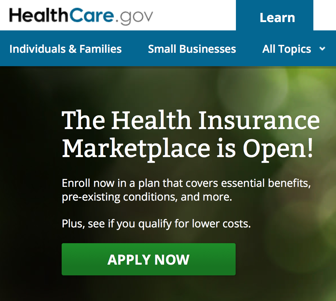
This is about what you can learn by watching someone (healthcare.gov) launch a new website.
#1 Load times matter
Page load time is how long it takes the end user’s computer to see a page on your website. This is measured in seconds. A slower load time can be caused by many reasons such as:
-A user having a slower Internet connection
-A user having an older computer
-A user being farther away from the server
-A script that didn’t load properly and timed out
-Too many users trying to access the same page at the same time (Wouldn’t we all like to have this problem?)
Regardless of the reason, a slow load time will lead to a higher bounce rate and abandon rate. This is especially true in 2013 as more and more users are accessing your site from a mobile device instead of a desktop. What does that mean? It means people will give up on your beautiful website before they give a gift.
What can you do?
Know your load times within Google Analytics. Watch your mobile traffic bounce rate. And know that not everyone has the newest computer or the lightning-fast Internet connection that you do. Sometimes simpler is better when it comes to load times and online donations.
#2 404 Errors
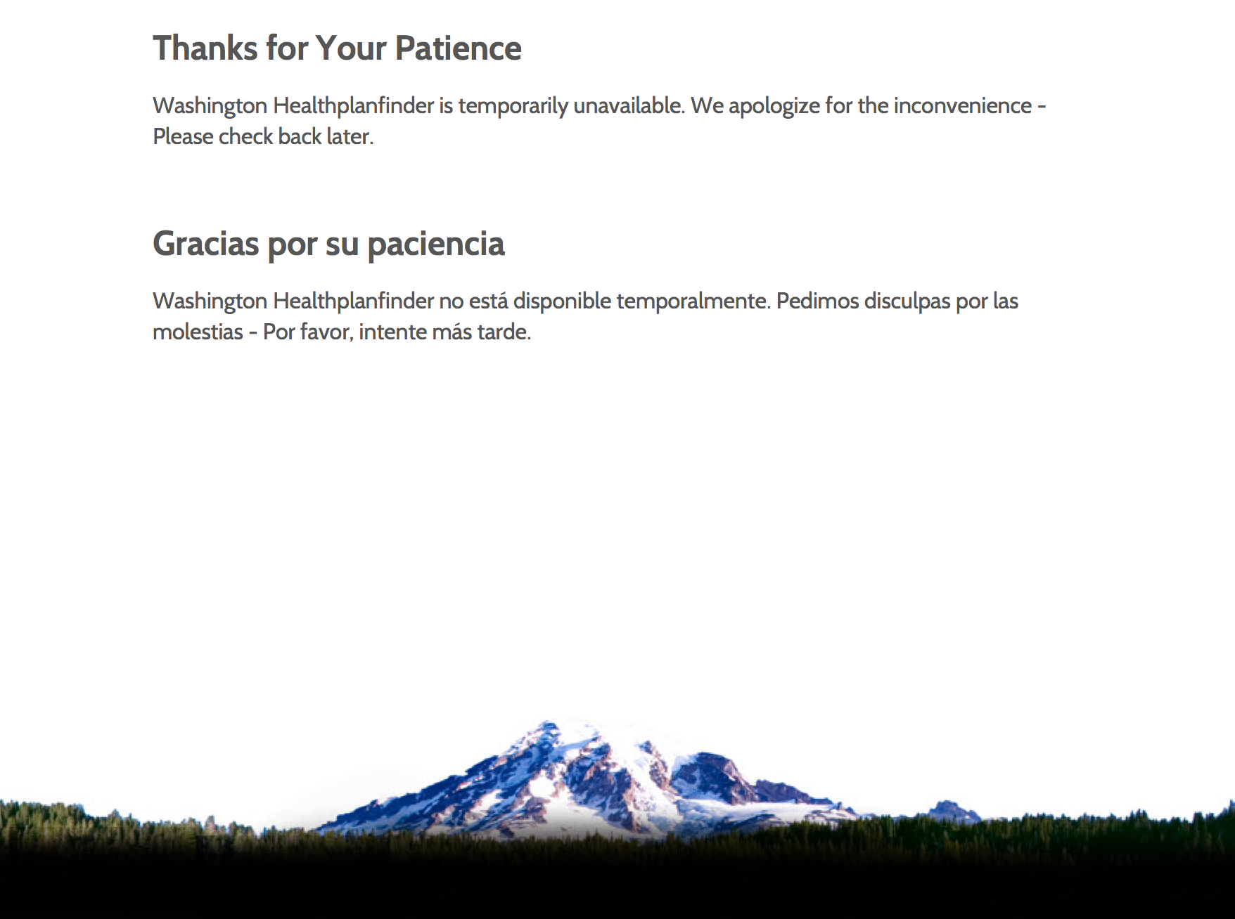 AKA page not found. When you launch a new site, testing is one of the last and most important steps to take. Beyond the design, copy, and proofing, it’s important to test each and every link to ensure they work.
The other important takeaway on 404 errors is this: they happen. Someone will type in yourwebsite.org/content and not find the content they are looking for. Bam, they hit a 404 page.
What can you do?
You can and should create a 404 page with a new website. It’s your opportunity to tell a user you’re sorry they can’t find the page they were looking for and perhaps provide them with other alternate links. It could make the difference between a user leaving frustrated and staying on your site. People surfing your website usually won’t tell you about the problem, they’ll just disappear, so double and triple check.
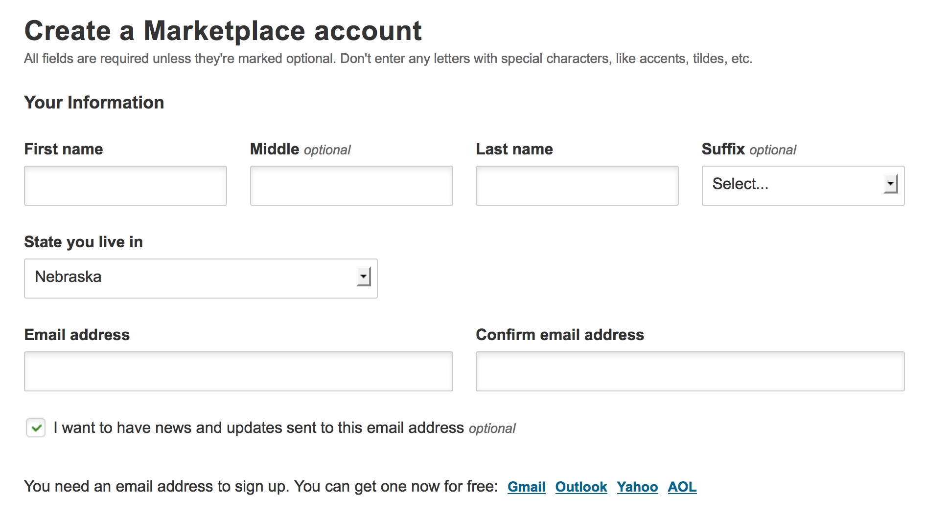
#3 DO NOT require someone to sign in!
 What is the purpose of the site?
The purpose of the heathcare.gov is to view and compare health insurance plans.
On your website . . . I am hoping a primary reason is to make a monetary donation.
Don’t make someone sign in or create an account to accomplish their goal — especially for your mobile users with tiny screens! Users should be free to view health insurance plans, put an item in a shopping cart or view your donation form without having to create a username and password.
By knowing the end goal, you should design a process that has as few steps and is as simple and mobile-friendly as possible. Think easy!
What can you do?
Do you require someone to sign in prior to giving you a gift? Please consider changing this. Regardless, look at the steps and number of pages it takes to give a gift. Know your conversion rate (# users who view your donation form/# of donations received.) And always be asking “how can we improve the process of making a donation on our website?”
What’s the moral of the story?
Learn from other’s mistakes. Problems happen on websites (we are human after all and it is technology). But use these problems in shopping for a healthcare plan to help you improve your website.
What about you? Did you try the healthcare.gov website? How does your website stack up? I’d love to hear from you.

Lindsey Lind
Vice President of eStrategy, Oneicity
