Last week I had the incredible opportunity to attend a day of the Tableau software conference in Seattle. The facility was top-notch, and the production — from the food to the sessions — was flawless.
I stumbled into Tableau’s data visualization software at the end of 2008 through the recommendation of a good friend. I watched their online demo and was amazed. So I made Mr. Thomas watch their demo. He’s not a geeky data person like I might be. But he is highly visual. He was completely blown away. We both knew we were looking at the future of data and reporting for our clients. And do you want to know some good news? The future is now.
At this conference, I bumped into organizations and corporations of all shapes and sizes. All of them using Tableau to transform the way they do business. It’s hard for me to use words to do justice to something that is so visual and interactive, but let me give it the introductory try here. (And please know I am not an employee of Tableau, so know that my affection for their product is all mine!)
 What is data visualization? Simply put it’s a visual and meaningful representation of your data. It’s much, much more than an excel chart or data table. Check out this list of 50 examples of data visualization — these pictures speak volumes over my meager words. The kicker with Tableau is that it makes your data visualization actionable.
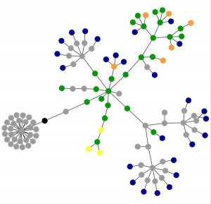
To the right here is a data visualization of the oneicity website using the Aharef tool.
So back to the conference… I attended a keynote session by Pat Hanrahan, CTO and co-founder of Tableau. He said that data visualization today is analogous to search back in the mid-90s when Google was introduced. Think back 15 years (or 10 or 5…) when you first started “googling” — it took awhile to understand how to use it and to comprehend its power, right? And now today “everyone” is using it…and that is the future of data visualization.
He shared that one of their challenges is to convince people that data visualization is valuable and important. And he gave three quick reasons…see what you think about this:
1. Data visualization lets people solve a problem.
Hanrahan asked this question: “What if you could solve a problem by painting a picture of what you wanted to see?” For the highly visual among you, you get this intuitively. You are the back-of-the-napkin sketchers and you don’t particularly want a list of all the data values, you want the trends, the highs, the lows. You clearly want to know where to poke or what rocks to turn over.
2. Data visualization is interactive and active.
And it’s not static or stale. That means the data is living and breathing and constantly refreshed. And it’s just true that the more you can act on something, the more you can understand it.
3. Data visualization facilitates collaboration.
Hanrahan called this the “collective IQ.” Working alone encourages silos and biases. Working in collaboration with others means you have their best thinking and experience on your project. You have built-in checks and balances.
Hanrahan concluded with this: “Visualization has been shown scientifically that it makes it easier to solve problems and to make decisions.”
Who of us working in nonprofit doesn’t want this kind of tool?
This topic of data visualization is here to stay so we’ll be back to it often (or as often as Mr. Thomas will let me!).
A couple of questions for you: Have you ever heard of this term “data visualization”? Are you satisfied that you are getting what you need from your data in order to “solve problems and make decisions”? I’d love to hear from you about this.

Kris Hoots
Partner, Oneicity

3 thoughts on “intro to data visualization”
Exciting to say the least – could this serve Shiloh in any way?
@Tim I thought you would like this stuff. 🙂 Steve and I are talking to the guys at Tableau about creating a data visualization demo that is specifically geared toward nonprofits. We’ll be sure to let you be one of the first to know when we get this done!
I haven’t used Tableau personally, but I’ve been very impressed with their data visualization capabilities. I’d be very interested to in your demo geared towards non-profits.